


م€گ2025ه¹´ç‰ˆم€‘و‰±مپ„م‚„مپ™مپ„مƒ¬م‚¹مƒمƒ³م‚·مƒ–مپ§مپ®و¨ھن¸¦مپ³(CSS)
م‚«مƒ†م‚´مƒھï¼ڑWEBهˆ¶ن½œ
م‚؟م‚°ï¼ڑ
※ه½“م‚µم‚¤مƒˆمپ¯م‚¢مƒ•م‚£مƒھم‚¨م‚¤مƒˆه؛ƒه‘ٹم‚’هˆ©ç”¨مپ—مپ¦مپ„مپ¾مپ™م€‚
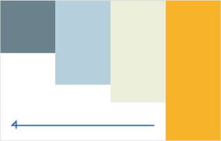
مƒ¬م‚¹مƒمƒ³م‚·مƒ–م‚µم‚¤مƒˆمپ®ن½œوˆگمپ®éڑ›مپ«مƒ،مƒ³مƒ†مƒٹمƒ³م‚¹مپ®مپ—م‚„مپ™مپ„مƒœمƒƒم‚¯م‚¹مپ®و¨ھن¸¦مپ³مپ®çµ„مپ؟و–¹م‚’ç´¹ن»‹مپ—مپ¾مپ™م€‚
flexbox(مƒ•مƒ¬مƒƒم‚¯م‚¹مƒœمƒƒم‚¯م‚¹)م‚’ن½؟用مپ—مپںو¨ھن¸¦مپ³مپ§مپ™م€‚
وک”مپ¯floatمپھمپ©م‚’ن½؟用مپ—مپ¦مپ„مپ¾مپ—مپںمپŒçڈ¾هœ¨مپ§مپ¯IE(Internet Explorer)مپ®و‰“مپ،هˆ‡م‚ٹمپ«مپھمپ£مپںمپںم‚پم€پflexboxم‚’و°—مپ«مپ›مپڑن½؟用مپ§مپچم‚‹م‚ˆمپ†مپ«مپھم‚ٹمپ¾مپ—مپںم€‚
مƒ™مƒ³مƒ€مƒ¼مƒ—مƒ¬مƒ•م‚£مƒƒم‚¯م‚¹م‚‚ه؟…è¦پمپ‚م‚ٹمپ¾مپ›م‚“م€‚
flexboxمپ¯éه¸¸مپ«و‹،ه¼µو€§مپŒé«کمپڈم€پو‰±مپ„م‚„مپ™مپ„CSSمپ®و©ں能مپ§مپ™م€‚
ن»ٹه›مپ¯م€پمƒ،مƒ‡م‚£م‚¢م‚¯م‚¨مƒھم‚’ن½؟مپ£مپ¦و“چن½œمپ—مپ¦مƒ¬م‚¹مƒمƒ³م‚·مƒ–مپھمƒ¬م‚¤م‚¢م‚¦مƒˆçµ„م‚’ç´¹ن»‹مپ—مپ¾مپ™م€‚
ç°،هچکمپ«هڈ¯ه¤‰مپ®مƒœمƒƒم‚¯م‚¹مپŒçµ„م‚پم‚‹م‚³مƒ¼مƒ‰مپ®ç´¹ن»‹مپ§مپ™م€‚
م‚³مƒ¼مƒ‰مپ®èھ¬وکژمپ¯وœ€ه¾Œمپ«و›¸مپچمپ¾مپ™م€‚
ç›®و¬،
5هˆ—مپ®و¨ھن¸¦مپ³
HTML
<div class="col_5">
<div>
مپ“مپ“مپ«ه†…ه®¹
</div>
<div>
مپ“مپ“مپ«ه†…ه®¹
</div>
<div>
مپ“مپ“مپ«ه†…ه®¹
</div>
<div>
مپ“مپ“مپ«ه†…ه®¹
</div>
<div>
مپ“مپ“مپ«ه†…ه®¹
</div>
</div>
CSS
*, *:before, *:after {
    box-sizing: border-box;
}

.col_5{
    width: 100%;
    display: flex;
    flex-wrap: wrap;
}
.col_5 > *{
    width: calc( 20% - 20px );
    margin-right: 25px;
    margin-bottom: 25px;
}
.col_5 > *:nth-child(5n){
    margin-right: auto;
}
@media screen and (max-width: 960px) {
    .col_5 > *{
        width: calc( 25% - 9px );
        margin-right: 12px;
        margin-bottom: 12px;
    }
    .col_5 > *:nth-child(5n){
        margin-right: 12px;
    }
    .col_5 > *:nth-child(4n){
        margin-right: auto;
    }
}
@media screen and (max-width: 580px) {
    .col_5 > *{
        width: calc( 33.33333% - 8px ) ;
    }
    .col_5 > *:nth-child(5n){
        margin-right: 12px;
    }
    .col_5 > *:nth-child(4n){
        margin-right: 12px;
    }
    .col_5 > *:nth-child(3n){
        margin-right: auto;
    }
}
4هˆ—مپ®و¨ھن¸¦مپ³
HTML
<div class="col_4">
<div>
مپ“مپ“مپ«ه†…ه®¹
</div>
<div>
مپ“مپ“مپ«ه†…ه®¹
</div>
<div>
مپ“مپ“مپ«ه†…ه®¹
</div>
<div>
مپ“مپ“مپ«ه†…ه®¹
</div>
</div>
CSS
*, *:before, *:after {
    box-sizing: border-box;
}
.col_4{
    width: 100%;
    display: flex;
    flex-wrap: wrap;
}
.col_4 < *{
    width: calc( 25% - 9px );
    margin-right: 12px;
    margin-bottom: 12px;
}
.col_4 < *:nth-child(4n){
    margin-right: auto;
}
@media screen and (max-width: 960px) {
    .col_4 < *{
        width: calc( 33.33333% - 8px ) ;
    }
    .col_4 < *:nth-child(4n){
        margin-right: 12px;
    }
    .col_4 < *:nth-child(3n){
        margin-right: auto;
    }
}
@media screen and (max-width: 580px) {
    .col_4 < *{
        width: calc( 50% - 6px ) ;
    }
    .col_4 < *:nth-child(3n){
        margin-right: 12px;
    }
    .col_4 < *:nth-child(2n){
        margin-right: auto;
    }
}
3هˆ—مپ®و¨ھن¸¦مپ³
HTML
<div class="col_3">
<div>
مپ“مپ“مپ«ه†…ه®¹
</div>
<div>
مپ“مپ“مپ«ه†…ه®¹
</div>
<div>
مپ“مپ“مپ«ه†…ه®¹
</div>
<div>
مپ“مپ“مپ«ه†…ه®¹
</div>
</div>
CSS
*, *:before, *:after {
    box-sizing: border-box;
}
.col_3{
    width: 100%;
    display: flex;
    flex-wrap: wrap;
}
.col_3 > *{
    width: calc( 33.33333% - 8px ) ;
    margin-right: 12px;
    margin-bottom: 12px;
}
.col_3 > *:nth-child(3n){
    margin-right: auto;
}
.col_3 > * > *{
    background: #ff0000;
    height: 120px;
    position: relative;
    overflow: hidden
}
@media screen and (max-width: 960px) {
    .col_3 > *{
        width: calc( 50% - 6px ) ;
    }
    .col_3 > *:nth-child(3n){
        margin-right: 12px;
    }
    .col_3 > *:nth-child(2n){
        margin-right: auto;
    }
}
@media screen and (max-width: 580px) {
    .col_3 > *{
        width: 100%;
        margin-right: auto;
    }
    .col_3 > *:nth-child(3n){
        margin-right: auto;
    }
}
2هˆ—مپ®و¨ھن¸¦مپ³
HTML
<div class="col_2">
<div>
مپ“مپ“مپ«ه†…ه®¹
</div>
<div>
مپ“مپ“مپ«ه†…ه®¹
</div>
<div>
مپ“مپ“مپ«ه†…ه®¹
</div>
<div>
مپ“مپ“مپ«ه†…ه®¹
</div>
</div>
CSS
*, *:before, *:after {
    box-sizing: border-box;
}
.col_2{
    width: 100%;
    display: flex;
    flex-wrap: wrap;
}
.col_2 > *{
    width: calc( 50% - 6px ) ;
    margin-right: 12px;
    margin-bottom: 12px;
}
.col_2 > *:nth-child(2n){
    margin-right: auto;
}
.col_2 > * > *{
    background: #ff0000;
    height: 120px;
    position: relative;
    overflow: hidden
}
@media screen and (max-width: 960px) {
    .col_2 > *{
        width: 100%;
        margin-right: auto;
    }
}
م‚³مƒ¼مƒ‰مپ®èھ¬وکژ
ه؟…è¦پمپھم‚³مƒ¼مƒ‰مپ¯4مپ¤مپ§مپ™م€‚
box-sizing: border-box
paddingمپ¨borderمپ®ه¹…م‚’è¦پç´ مپ®ه¹…مپ¨é«کمپ•مپ«هگ«م‚پم‚‹مپ¨مپ„مپ†م‚³مƒ¼مƒ‰مپ§مپ™م€‚
è¦پمپ¯مƒœمƒƒم‚¯م‚¹مپ®ه†…هپ´مپ«borderم€پpaddingمپŒه…¥م‚ٹمپ¾مپ™م€‚
مپ“م‚“مپھو„ںمپکمپ§مپ™م€‚
display: flex
ن¸¦مپ¹مپںمپ„è¦پç´ مپ®è¦ھè¦پç´ مپ«ه¯¾مپ—مپ¦وŒ‡ه®ڑمپ™م‚‹مپ¨ç›´ن¸‹مپ®è¦پç´ م‚’و¨ھن¸¦مپ³مپ—مپ¾مپ™م€‚
flexbox(مƒ•مƒ¬مƒƒم‚¯م‚¹مƒœمƒƒم‚¯م‚¹)مپ«é–¢مپ—مپ¦مپ®مپ•م‚‰مپ«è©³مپ—مپ„èھ¬وکژمپ¯و¨ھن¸¦مپ³م‚’مƒم‚¹م‚؟مƒ¼ï¼پCSS Flexboxم‚’ه¾¹ه؛•è§£èھ¬مپ§ç´¹ن»‹مپ—مپ¦مپ„مپ¾مپ™م€‚
flex-wrap: wrap
display: flexمپ§و¨ھن¸¦مپ³مپ•مپ›مپںè¦پç´ م‚’ه›م‚ٹè¾¼مپ؟مپ•مپ›مپ¾مپ™م€‚
margin
é–“éڑ”م‚’هڈ–م‚‹ه ´هگˆمپ«مپ¯مƒمƒ¼م‚¸مƒ³م‚’è¨ه®ڑمپ™م‚‹ه؟…è¦پمپŒمپ‚م‚ٹمپ¾مپ™م€‚
مپ¾مپںم€پnth-childمپ§و¨ھه¹…م‚’مƒھم‚»مƒƒمƒˆمپ—مپ¾مپ™م€‚
é–“éڑ”م‚’هڈ–م‚‰مپھمپ„ه ´هگˆمپ¯مƒمƒ¼م‚¸مƒ³مپ¯ن¸چè¦پمپ¨مپھم‚ٹم€پwidthمپ®وŒ‡ه®ڑو–¹و³•م‚‚مپ•م‚‰مپ«م‚¹مƒمƒ¼مƒˆمپ«مپھم‚ٹمپ¾مپ™م€‚
//و¨ھمپ«5مپ¤éڑ™é–“مپھمپ—مپ§ن¸¦مپ¶
.col_5 > *{
width: 20%;
}
@media screen and (max-width: 960px) {
//م‚¹م‚¯مƒھمƒ¼مƒ³م‚µم‚¤م‚؛مپŒ960pxن»¥ن¸‹مپ®ه ´هگˆمپ¯و¨ھمپ«2مپ¤éڑ™é–“مپھمپ—مپ§ن¸¦مپ¶
.col_5 > *{
width: 50%;
}
}
ن¸¦مپ³و–¹هگ‘مپھمپ©م‚’وŒ‡ه®ڑمپ™م‚‹مپ«مپ¯مƒ»مƒ»مƒ»مƒ»
و¨ھن¸¦مپ³مپ®ه¯„مپ›(و¨ھ)و–¹هگ‘م‚’وŒ‡ه®ڑ
cssمپ§justify-contentم‚’وŒ‡ه®ڑمپ™م‚Œمپ°ه·¦ه¯„مپ›م€پهڈ³ه¯„مپ›م€په·¦هڈ³ه‡ç‰مپھمپ©وں”è»ںمپ«مƒ¬م‚¤م‚¢م‚¦مƒˆم‚’組م‚پم‚‹م‚ˆمپ†مپ«مپھم‚ٹمپ¾مپ™م€‚
※justify-contentمپ¯è¦ھè¦پç´ مپ«وŒ‡ه®ڑمپ™م‚‹مپ“مپ¨مپ§ç›´ن¸‹مپ®è¦پç´ مپŒو¨ھن¸¦مپ³مپ™م‚‹م‚ˆمپ†مپ«مپھم‚ٹمپ¾مپ™م€‚
//ه·¦ه¯„مپ›مپ§و¨ھن¸¦مپ³(هˆوœںه€¤) justify-content: normal; //ن¸ٹمپ¨normalمپ¨هگŒمپکمپڈه·¦ه¯„مپ›مپ§و¨ھن¸¦مپ³(ه°‘مپ—مپ مپ‘ç•°مپھم‚ٹمپ¾مپ™م€‚ن»–مپ®مƒڑمƒ¼م‚¸مپ§è§£èھ¬مپ—مپ¦مپٹم‚ٹمپ¾مپ™م€‚) justify-content: flex-start; //ه·¦هڈ³ه‡ç‰مپ§و¨ھن¸¦مپ³ justify-content: space-between; //هڈ³ه¯„مپ›مپ§و¨ھن¸¦مپ³ justify-content: flex-end;
justify-contentمپ«é–¢مپ—مپ¦مپ®مپ•م‚‰مپ«è©³مپ—مپ„èھ¬وکژمپ¯و¨ھن¸¦مپ³م‚’مƒم‚¹م‚؟مƒ¼ï¼پCSS Flexboxمپ§ç´¹ن»‹مپ—مپ¦مپ„مپ¾مپ™م€‚
و¨ھن¸¦مپ³مپ®ç¸¦و–¹هگ‘م‚’وŒ‡ه®ڑ
cssمپ§align-itemsم‚’وŒ‡ه®ڑمپ™م‚Œمپ°ç¸¦و–¹هگ‘مپ®ن½چç½®م‚’èھ؟و•´مپ™م‚‹مپ“مپ¨مپŒمپ§مپچمپ¾مپ™م€‚
※justify-contentمپ¯è¦ھè¦پç´ مپ«وŒ‡ه®ڑمپ™م‚‹مپ“مپ¨مپ§ه‚ç›´و–¹هگ‘مپ®ن½چç½®وڈƒمپˆمپŒهڈ¯èƒ½مپ«مپھم‚ٹمپ¾مپ™م€‚
//ه‚ç›´و–¹هگ‘م‚’ن¸ٹوڈƒمپˆ align-items: flex-start; //ه‚ç›´و–¹هگ‘م‚’ن¸‹وڈƒمپˆ align-items: flex-end; //ه‚ç›´و–¹هگ‘م‚’ن¸ه¤®وڈƒمپˆ align-items: center;
align-itemsمپ«é–¢مپ—مپ¦مپ®مپ•م‚‰مپ«è©³مپ—مپ„èھ¬وکژمپ¯و¨ھن¸¦مپ³م‚’مƒم‚¹م‚؟مƒ¼ï¼پCSS Flexboxم‚’ه¾¹ه؛•è§£èھ¬م‚’مپ”覧مپڈمپ مپ•مپ„م€‚
مپ¾مپ¨م‚پ
ن»¥ن¸ٹم€پم€Œو‰±مپ„م‚„مپ™مپ„مƒ¬م‚¹مƒمƒ³م‚·مƒ–مپ§مپ®و¨ھن¸¦مپ³م€چمپ§مپ—مپںم€‚
8ه¹´ه‰چمپڈم‚‰مپ„مپ‹مپ¨و€مپ„مپ¾مپ™مپŒIEمپ¸مپ®ه¯¾ه؟œمپŒه؟…è¦پمپ مپ£مپںو™‚مپ¯مپ‹مپھم‚ٹé¢ه€’مپ§مپ—مپںمپŒم€پçڈ¾هœ¨مپ¯flexbox(مƒ•مƒ¬مƒƒم‚¯م‚¹مƒœمƒƒم‚¯م‚¹)م‚’è¦ھè¦پç´ مپ«وŒ‡ه®ڑمپ™م‚‹مپ مپ‘مپ§ç°،هچکمپ«و¨ھن¸¦مپ³مپ§مپچم‚‹م‚ˆمپ†مپ«مپھم‚ٹمپ¾مپ—مپںم€‚
م‚¯مƒم‚¹مƒ–مƒ©م‚¦م‚¶مƒپم‚§مƒƒم‚¯مپ®و™‚é–“م‚‚مپ‹مپھم‚ٹ節約مپ§مپچمپ¾مپ™م€‚
çڈ¾هœ¨م€پهˆ¶ن½œçڈ¾ه ´مپ§ن½؟用مپ™م‚‹و¨ھن¸¦مپ³و–¹و³•مپ¯flexbox(مƒ•مƒ¬مƒƒم‚¯م‚¹مƒœمƒƒم‚¯م‚¹)مپ¨inline-block(م‚¤مƒ³مƒ©م‚¤مƒ³مƒ–مƒمƒƒم‚¯)مپ«مپھمپ£مپ¦مپ„مپ¾مپ™م€‚
و¨ھن¸¦مپ³مپŒçگ†è§£مپ§مپچم‚Œمپ°ه؟œç”¨مپ§م€پمپ»مپ¨م‚“مپ©مپ®مƒ¬م‚¤م‚¢م‚¦مƒˆçµ„مپ؟مپ¯مپ§مپچم‚‹م‚ˆمپ†مپ«مپھم‚‹مپ®مپ§مپœمپ²م€پç؟’ه¾—مپ—مپ¦مپڈمپ مپ•مپ„م€‚
