大手サイトのフォント周り(サイズ・行間・文字送り等)を調べてみた。2016年11月
カテゴリ:WEB制作
タグ:
※当サイトはアフィリエイト広告を利用しています。
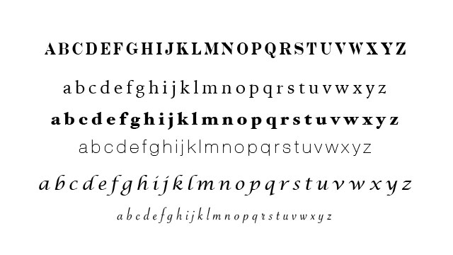
見やすいフォントを考えるにあたって大手情報サイトやまとめサイトなどのフォントサイズ、文字送り、行間等を調べてみました。
読みやすいサイト制作の参考になればと思います。
body {
    font-family: arial,sans-serif;
}

h2 {
    line-height: 1.3;
    font-weight: bold;
    font-size: 20px;
    text-indent: 22px;
}

p {
    line-height: 1.5;
    font-size: 14px;
}
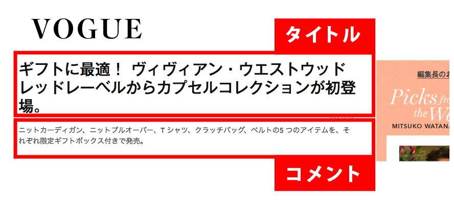
2.VOGUE
body {
    font-family: avenir_medium,"ヒラギノ角ゴ Pro W3","Lucida Grande","Hiragino Kaku Gothic Pro",メイリオ,Verdana,"MS Pゴシック",sans-serif;
}

h2 {
    font-size:30px;
    line-height:36px;
    font-weight: bold;
}

p {
    font-size:14px;
    line-height:155%;
}
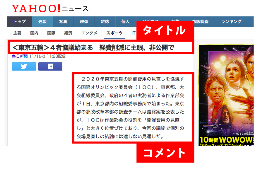
3.Yahoo!ニュース
body {
    font-size: 16px;/*各ブラウザのフォントサイズは16px*/
}

h2 {
    font-size: 140%;
    font-weight:bold;
    letter-spacing:-0.05em;
    line-height: 1.3em;
}

p {
    font-size:94%;
    line-height: 1.8em;
}
4.日本経済新聞
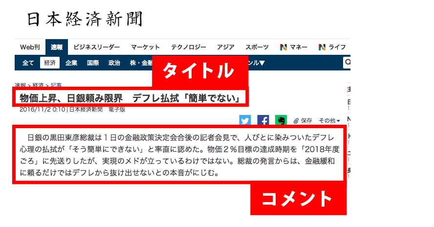
body {
    font-size: 16px;/*各ブラウザのフォントサイズは16px*/
}

h2 {
    font-size: 140%;
    font-weight:bold;
    letter-spacing:-0.05em;
    line-height: 1.3em;
}

p {
    font-size:94%;
    line-height: 1.8em;
}
5.ダイアモンド・オンライン
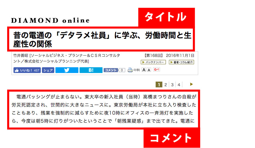
body {
    font-size: 16px;/*各ブラウザのフォントサイズは16px*/
}

h2 {
    font-size:27px;
    line-height:30px;
    font-weight: bold;
}

p {
    font-size:100%;
    line-height:1.8em;
    letter-spacing: 0.06em;
}
6.Apple
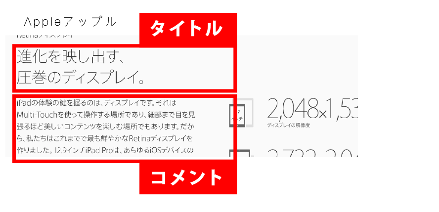
h2 {
    font-size:52px;
    line-height:1.07724;
    font-weight:200;
    letter-spacing:-.016em;
}

p {
    font-size:28px;
    line-height:1.28595;
    font-weight:300;
    letter-spacing:0em;
}
7.まとめ
新聞社やヤフーニュースなどの一般的なニュースを扱うところはフォントサイズ・文字送りなどはブラウザでのデフォルトが多いようです。
今回、掲載していない新聞社のサイトもフォントはブラウザのデフォルト設定を利用しているところがほとんどです。
IEでの画面拡大などによるレイアウト崩れなどを想定していることに加え、文字サイズを変更できる機能をサイトに導入しているためだと思われます。
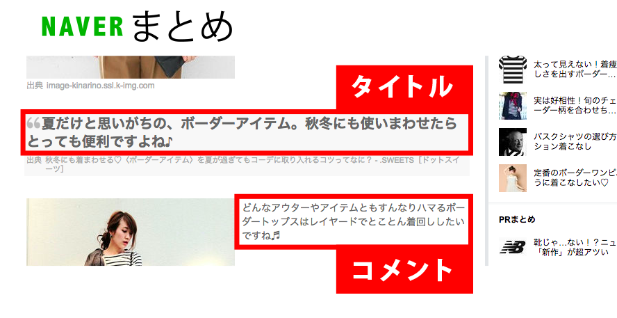
まとめサイトなどのコンテンツサイトみたいなところは若者を集客のメインターゲットにしているためか文字サイズは小さめでデザイン性も少し高い気がします。
読みやすさをメインとするなら、フォントサイズと文字送りはブラウザのデフォルト設定がベストなのかもしれませんね。